

@keemed/design · CedarCare Digital Care Console
CedarCare design system
One theme for the hospital console and the patient app. Every colour, size, radius, shadow and duration on this page comes from the design package; nothing is hard-coded. Switch the theme in the header to check dark mode.
Brand assets
Rendered from the content pack by pnpm -F @keemed/design brand, at the paths the catalog reserves. Their text is outlined, so nothing depends on a font.
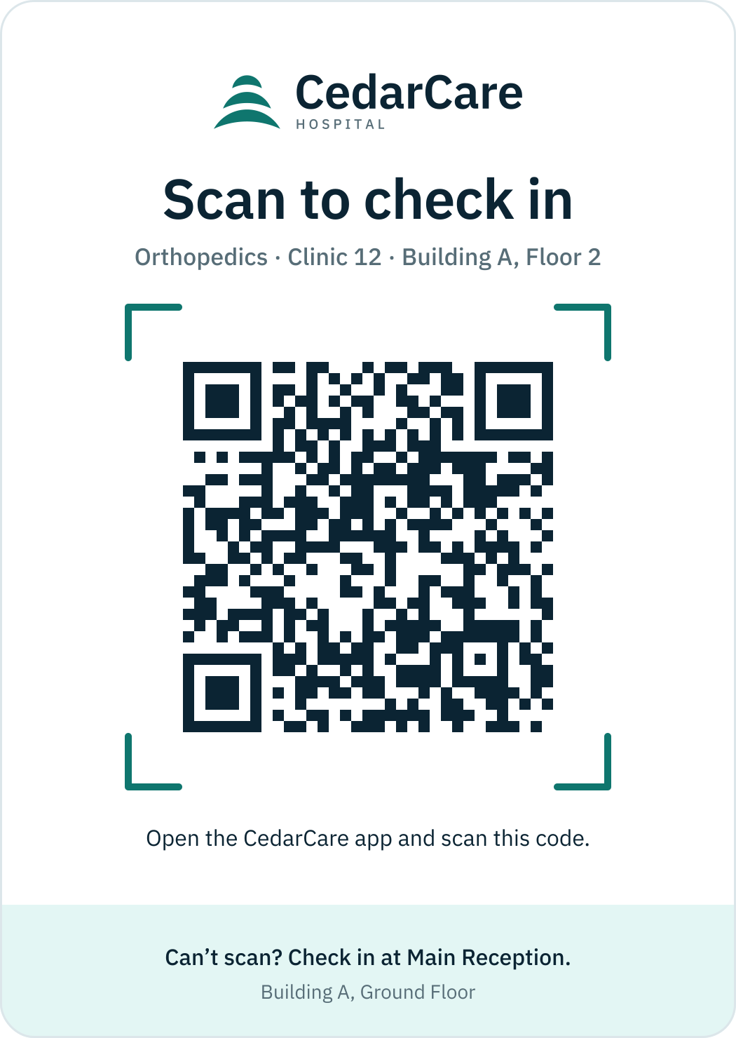
Clinic check-in QR
Encodes keemed:checkin:cedarcare:orthopedics-clinic-12. Print at 3 cm or larger, dark on light, never inverted.
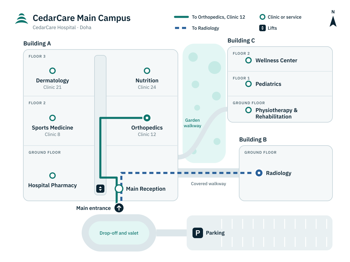
Campus map
Pins sit at each location's catalog map coordinates. Routes run from the main entrance to Clinic 12 (solid) and Radiology (dashed).
Avatars
Initials portraits until photography exists: teal for the hospital team, blue for patients. The fallback shows live initials while a file loads or if it is missing.
- KHDr. Karim HaddadConsultant Orthopedic Surgeon
- RKDr. Rami KhouryConsultant Sports Medicine Physician
- NFDr. Nadim FarahSpecialist Orthopedic Surgeon
- SNSarah NassarPhysiotherapist
- PRDr. Priya RamanConsultant Dermatologist
- HMDr. Hala MahmoudConsultant Pediatrician
- ECEmma ClarkeSenior Clinical Dietitian
- AMDr. Arjun MenonConsultant Radiologist
- MAMariam Al-AnsariCertified Wellness Coach
- DBDaniel BrooksRehabilitation Coach
- HAHessa Al-NaimiPatient Services Officer
- JRJoanna ReyesRegistered Nurse, Triage
- YSYoussef SalehPre-Authorization Officer
- VIVikram IyerAccounts Officer
- SASamira AzizHospital Director
- AMAlex MansourPatient
- MMMaya MansourPatient
- SMSami MansourPatient
- LMLea MansourPatient
Colour
Semantic tokens with their light and dark values. Text tokens list every ground they are promised to read on, with the WCAG ratio in light · dark (the design package tests each pair).
Surfaces and text
Page, cards, popovers, muted bands, borders and focus.
background
#f5f8f9 · #0b1a22
Page ground (cool mist) of both apps. Carries foreground and muted-foreground text.
foreground
#0b2433 · #f5f8f9
Default text and icons. Reads on background, card, popover, muted, secondary, accent and glass.
- Aaon background15.0 · 16.6
- Aaon card16.0 · 14.9
- Aaon popover16.0 · 12.6
- Aaon muted13.9 · 12.6
- Aaon primary-soft14.3 · 11.0
- Aaon signal-soft14.5 · 11.5
- Aaon glass15.7 · 15.5
card
#ffffff · #13242d
Cards, sheets, table bodies, inputs. Carries card-foreground, muted-foreground, primary and every status ink.
card-foreground
#0b2433 · #f5f8f9
Titles, values and body text on card (patient cards, console panels, table cells).
- Aaon card16.0 · 14.9
popover
#ffffff · #1e313a
Menus, popovers, tooltips, dialogs: one step above card in dark. Carries popover-foreground and muted-foreground.
popover-foreground
#0b2433 · #f5f8f9
Text and icons on popover: menu items, dialog copy, tooltips.
- Aaon popover16.0 · 12.6
secondary
#e9f0f2 · #1e313a
Secondary button fill, segmented-control track. Carries secondary-foreground.
secondary-foreground
#0b2433 · #f5f8f9
Label and icon of secondary buttons and the selected segment text. Reads on secondary.
- Aaon secondary13.9 · 12.6
muted
#e9f0f2 · #1e313a
Neutral chip ground, skeleton blocks, disabled fields, table header band. Carries muted-foreground and foreground.
muted-foreground
#576d77 · #a2b5bd
Secondary text: captions, hints, timestamps, placeholder text. Reads on background, card, popover, muted and secondary.
- Aaon background5.1 · 8.3
- Aaon card5.4 · 7.5
- Aaon popover5.4 · 6.4
- Aaon muted4.7 · 6.4
- Aaon secondary4.7 · 6.4
- Aaon glass5.3 · 7.8
- Aaon primary-soft4.9 · 5.5
accent
#f2fcfb · #32464f
Hover and highlighted background of ghost buttons, menu items and list rows (dark: one step above popover, so a highlighted menu item shows). Carries accent-foreground and primary. Keyboard focus adds the ring; the tint alone is not a focus indicator.
accent-foreground
#0b2433 · #f5f8f9
Label of a hovered ghost button, menu item or list row. Reads on accent.
- Aaon accent15.3 · 9.3
border
#dce6ea · #32464f
Decorative 1px hairlines: card edges, dividers, table rules. Never the only cue for a control or a state.
input
#788d96 · #7b9099
Borders that carry meaning: text fields, checkboxes, radios, switches. 3:1 (WCAG non-text contrast) on every ground a control can sit on: background, card, popover, accent, muted, secondary and primary-soft. Forms still belong on a card.
- Aaon background3.3 · 5.3
- Aaon card3.5 · 4.8
- Aaon popover3.5 · 4.0
- Aaon accent3.3 · 3.0
- Aaon muted3.0 · 4.0
- Aaon secondary3.0 · 4.0
- Aaon primary-soft3.1 · 3.5
ring
#0f766e · #6ec1b7
Focus rings (2px, offset 2px) on background, card, popover, muted, secondary, accent and primary-soft; menu items draw it inset.
- Aaon background5.1 · 8.4
- Aaon card5.5 · 7.6
- Aaon popover5.5 · 6.4
- Aaon accent5.2 · 4.7
- Aaon muted4.7 · 6.4
- Aaon secondary4.7 · 6.4
- Aaon primary-soft4.9 · 5.6
Brand and signal
Cedar teal for action and selection; cyan signal only for live and AI moments, never body text.
primary
#0f766e · #6ec1b7
Primary buttons, links, selected states, focus, progress chips (In Consultation, Processing). Text-safe on background, card and primary-soft.
- Aaon background5.1 · 8.4
- Aaon card5.5 · 7.6
- Aaon primary-soft4.9 · 5.6
- Aaon accent5.2 · 4.7
primary-foreground
#ffffff · #00322e
Label and icon on a primary or primary-hover fill.
- Aaon primary5.5 · 6.7
- Aaon primary-hover7.7 · 8.9
primary-hover
#045e57 · #9ed9d1
Hover and pressed fill of primary buttons. Carries primary-foreground.
primary-soft
#e3f6f4 · #173d42
Selected rows, progress chip ground, Next Recommended Action card wash. Carries primary text.
signal
#22b8cf · #22b8cf
Live, AI and sync moments only: live dot, AI glow, sync pulse, scan beam. A fill or glow, never text on light grounds; meaning always repeated in words (Live, AI Summary).
signal-foreground
#0b2433 · #002a31
Text and icons on a solid signal fill.
- Aaon signal6.7 · 6.4
signal-soft
#e8f7fa · #0e3a45
AI card wash and live highlight behind ai or foreground text.
Status
Ink, text-on-fill and soft ground per tone. Always with an icon or a word.
info
#28609a · #76ade9
Scheduled or waiting on someone else: Booked, Scheduled, Expected, Submitted. Text, icon and dot colour of info chips, alerts and banners. Reads on background, card, popover and info-soft. Always with an icon or a word, never colour alone.
- Aaon background6.1 · 7.5
- Aaon card6.5 · 6.8
- Aaon popover6.5 · 5.7
- Aaon info-soft5.6 · 5.2
info-foreground
#ffffff · #082644
Text and icons on a solid info fill (toast, badge, filled button). Reads on info only.
- Aaon info6.5 · 6.5
info-soft
#e1effe · #1c384e
Tinted ground of info chips, alerts and row highlights. Carries info text; never body text in foreground colour on top of it.
success
#097248 · #6cbf92
Done and positive: Paid, Approved, Checked In, Completed, Connected. Text, icon and dot colour of success chips, alerts and banners. Reads on background, card, popover and success-soft. Always with an icon or a word, never colour alone.
- Aaon background5.6 · 8.0
- Aaon card6.0 · 7.2
- Aaon popover6.0 · 6.1
- Aaon success-soft5.2 · 5.5
success-foreground
#ffffff · #002f1a
Text and icons on a solid success fill (toast, badge, filled button). Reads on success only.
- Aaon success6.0 · 6.7
success-soft
#e1f4e8 · #163c38
Tinted ground of success chips, alerts and row highlights. Carries success text; never body text in foreground colour on top of it.
warning
#935801 · #e4a25d
Blocked until someone acts: Payment Due, Copay Due, Needs Information. Text, icon and dot colour of warning chips, alerts and banners. Reads on background, card, popover and warning-soft. Always with an icon or a word, never colour alone.
- Aaon background5.4 · 8.1
- Aaon card5.8 · 7.3
- Aaon popover5.8 · 6.2
- Aaon warning-soft5.2 · 5.6
warning-foreground
#ffffff · #402200
Text and icons on a solid warning fill (toast, badge, filled button). Reads on warning only.
- Aaon warning5.8 · 6.7
warning-soft
#fff1e4 · #393522
Tinted ground of warning chips, alerts and row highlights. Carries warning text; never body text in foreground colour on top of it.
danger
#a32f2b · #f78176
Failed, rejected, offline; allergy alerts (Penicillin). Text, icon and dot colour of danger chips, alerts and banners. Reads on background, card, popover and danger-soft. Always with an icon or a word, never colour alone.
- Aaon background6.6 · 7.1
- Aaon card7.0 · 6.3
- Aaon popover7.0 · 5.4
- Aaon danger-soft6.0 · 5.3
danger-foreground
#ffffff · #480b0a
Text and icons on a solid danger fill (toast, badge, filled button). Reads on danger only.
- Aaon danger7.0 · 6.3
danger-soft
#fee8e5 · #3d2b30
Tinted ground of danger chips, alerts and row highlights. Carries danger text; never body text in foreground colour on top of it.
ai
#006877 · #22b8cf
AI-produced or live content: AI Summary labels, Live connection. Text, icon and dot colour of ai chips, alerts and banners. Reads on background, card, popover and ai-soft. Always with an icon or a word, never colour alone.
- Aaon background6.1 · 7.4
- Aaon card6.5 · 6.7
- Aaon popover6.5 · 5.7
- Aaon ai-soft5.4 · 5.2
- Aaon signal-soft5.9 · 5.2
ai-foreground
#ffffff · #002a31
Text and icons on a solid ai fill (toast, badge, filled button). Reads on ai only.
- Aaon ai6.5 · 6.4
ai-soft
#d5f0f6 · #0e3a45
Tinted ground of ai chips, alerts and row highlights. Carries ai text; never body text in foreground colour on top of it.
destructive
#a32f2b · #f78176
shadcn/ui alias of danger: destructive buttons and invalid-field borders. Text-safe on background and card.
- Aaon background6.6 · 7.1
- Aaon card7.0 · 6.3
destructive-foreground
#ffffff · #480b0a
Label on a destructive fill.
- Aaon destructive7.0 · 6.3
Console sidebar
Deep navy in both themes.
sidebar
#0b2433 · #0b2433
Console sidebar: deep navy in both themes. Carries sidebar-foreground and sidebar-muted-foreground.
sidebar-foreground
#f5f8f9 · #f5f8f9
Sidebar item labels and icons. Reads on sidebar and sidebar-accent.
- Aaon sidebar15.0 · 15.0
- Aaon sidebar-accent11.7 · 11.7
sidebar-muted-foreground
#a2b5bd · #a2b5bd
Sidebar section labels, the Powered by KeeMed OS footer, inactive counts. Reads on sidebar and sidebar-accent.
- Aaon sidebar7.5 · 7.5
- Aaon sidebar-accent5.9 · 5.9
sidebar-primary
#6ec1b7 · #6ec1b7
Active item marker and active icon in the sidebar; role switcher selection.
- Aaon sidebar7.6 · 7.6
sidebar-primary-foreground
#00322e · #00322e
Text on a sidebar-primary fill.
- Aaon sidebar-primary6.7 · 6.7
sidebar-accent
#17374a · #17374a
Hovered and active sidebar rows. Carries sidebar-accent-foreground.
sidebar-accent-foreground
#ffffff · #ffffff
Label of the hovered or active sidebar row.
- Aaon sidebar-accent12.5 · 12.5
sidebar-border
#17374a · #17374a
Decorative dividers inside the sidebar.
sidebar-ring
#22b8cf · #22b8cf
Focus ring inside the sidebar (on sidebar and sidebar-accent).
- Aaon sidebar6.7 · 6.7
- Aaon sidebar-accent5.2 · 5.2
Charts
Six series, separable in colour-blind simulation; 3:1 on the page.
chart-1
#098073 · #039585
Series 1 (teal). Fixed order, never cycled; 4.5:1 on card and background in light, 3:1 in dark; legends and values stay in foreground text.
- Aaon card4.8 · 4.3
- Aaon background4.5 · 4.8
chart-2
#1d60bc · #498beb
Series 2 (blue), after chart-1 in fixed order. 3:1 on card and background.
- Aaon card6.1 · 4.7
- Aaon background5.7 · 5.2
chart-3
#df6c32 · #cb5a1a
Series 3 (orange), after chart-2 in fixed order. 3:1 on card and background.
- Aaon card3.3 · 3.8
- Aaon background3.1 · 4.2
chart-4
#a278e4 · #9065d0
Series 4 (violet), after chart-3 in fixed order. 3:1 on card and background.
- Aaon card3.3 · 3.8
- Aaon background3.1 · 4.2
chart-5
#786101 · #a98800
Series 5 (olive), after chart-4 in fixed order. 3:1 on card and background.
- Aaon card6.0 · 4.7
- Aaon background5.6 · 5.2
chart-6
#a13170 · #d15d9a
Series 6 (plum), the last slot: a 7th series folds into Other. 3:1 on card and background.
- Aaon card6.6 · 4.4
- Aaon background6.2 · 4.8
Glass and overlay
Glass on hero cards only, with a 16px blur.
glass
rgba(255, 255, 255, 0.7) · rgba(19, 36, 45, 0.66)
Hero cards only (patient status hero, Next Recommended Action), with a 16px backdrop blur. Carries foreground text (tested over background).
glass-border
rgba(255, 255, 255, 0.65) · rgba(255, 255, 255, 0.1)
1px edge of glass hero cards. Decorative.
overlay
rgba(11, 36, 51, 0.32) · rgba(2, 8, 12, 0.6)
Scrim behind dialogs, drawers and the Demo Director (fades in at motion base).
Tonal scales
50 lightest to 950 darkest, built in OKLCH from the seeds. Brand primary is teal.
Type
IBM Plex Sans, Sans Arabic and Mono through next/font. The console renders the compact scale; the patient app uses the same names at comfortable sizes.
Console scale
size / line height · weight · tracking (px). Patient sizes for reference.
- displayOne Patient. One Journey. One Connected Hospital.30/36 · 600 · -0.5Patient 34/40 · 700
- titleReception22/28 · 600 · -0.3Patient 28/34 · 600
- headingReady for Review16/22 · 600 · -0.1Patient 20/26 · 600
- bodyPatient reports right knee pain following football injury.14/20 · 400 · 0Patient 17/24 · 400
- labelSubmit to Insurer13/18 · 500 · 0Patient 15/20 · 500
- captionUpdated 3:42 PM12/16 · 400 · 0.1Patient 13/18 · 400
- numericQAR 48,65028/32 · 600 · -0.3Patient 28/32 · 600
- codeQC-2026-8842112/16 · 500 · 0Patient 13/18 · 500
IBM Plex Sans
400 · 500 · 600 · 700
IBM Plex Sans Arabic
400 · 600, ready for Arabic copy
IBM Plex Mono
500: references, receipts, IDs
Tabular figures
Money and counts line up
Space and shape
A 4px grid, six radii, navy-tinted shadows, and the console's compact density.
Spacing
- space-14px
- space-28px
- space-312px
- space-416px
- space-520px
- space-624px
- space-832px
- space-1040px
- space-1248px
- space-1664px
- gutter-patient16px
- gutter-console24px
Radius
- sm6px
- md10px
- lg12px
- xl16px
- 2xl24px
- fullfull
Shadows
Glass sits on hero cards only: glass fill, glass border, 16px blur.
Density
- control-patient52Patient primary/secondary buttons and text fields (52px tall, radius-lg).
- control-patient-sm44Patient chips, quick replies, segmented controls; the iOS minimum touch target.
- control-console36Console buttons, inputs, selects (default).
- control-console-sm32Console table actions, toolbar buttons, chips.
- control-console-lg44Nurse tablet vitals form and console primary CTAs on touch screens.
- row-patient56Patient list rows (ListRow).
- row-console44Console table rows and board list rows.
- touch-target44Minimum hit area on iOS and the web console on touch.
- touch-target-android48Minimum hit area on Android (the APK).
- sidebar-console248Console sidebar width (collapses to 72px icons under 1280px).
- topbar-console56Console top bar height.
- opacity-disabled0.4Disabled controls (P11 Confirm before a slot is picked).
Layers (z-index)
- z-base0Page content, cards and boards at rest.
- z-raised10Dragged board cards, sticky table headers inside a scroll area.
- z-sticky20Sticky section headers, the patient tab bar.
- z-header30Console top bar and sidebar, patient large-title header.
- z-overlay40Scrims (overlay colour) behind drawers and dialogs.
- z-drawer50Drawers, bottom sheets, the Demo Director panel.
- z-modal60Dialogs and the payment sheet.
- z-popover70Menus, selects, popovers.
- z-toast80Toasts and in-app notification banners.
- z-tooltip90Tooltips, above everything including toasts.
Motion
CSS first: transitions, @starting-style and React's <ViewTransition>. With reduced motion on, travel and scale drop to zero, loops stop on a static state and cross-fades remain.
Durations and easings
Press Play. Durations run at standard; easings run at deliberate (560ms).
- instant 100ms
- fast 160ms
- base 240ms
- slow 360ms
- deliberate 560ms
- pulse 600ms
- reveal 700ms
- sheet 400ms
- standard easing
- enter easing
- exit easing
- sheet easing
- linear easing
Loops
The only animations that repeat; at most one on screen in product.
C3 Status chip change
Label rolls in, ground cross-fades, one ring pulse.
C7 Insurer processing → Approved
Shimmer + spinner for 1800ms, then Approved and a toast.
C6 Completeness meter
Fill scales from the start edge over 800ms; past 90% it turns success.
C5 Structuring clinical note
1400ms, then sections fill 120ms apart.
C1 role switch: Console › Role switcher and /hospital. C2 board move: Console › Board. C8 count-up and chart reveal: Data display › KPI tiles. C9 drawer and C10 toasts: Overlays.
Forms
Fields carry a label, an optional hint and an error with an icon. Borders use the 3:1 input token; focus is a 2px ring.
As printed on the QID.
Checkbox
Switch
Radio group
Status
Every chip comes from the shared statuses map in @keemed/design, so the console and the patient app read the same. Meaning is never colour alone: icon and label always.
Tones
- neutralNot started
- infoScheduled, or waiting on someone else
- progressHappening now, or ready for the next step
- successDone
- warningBlocked until someone acts
- dangerFailed, rejected, offline
- aiAI-produced or live
appointment
- Status: Draft
- Status: Booked
- Status: Submission Fee Due
- Status: Ready for Check-In
- Status: Checked In
- Status: In Triage
- Status: Ready for Doctor
- Status: In Consultation
- Status: Completed
payment
- Status: Not Due
- Status: Due
- Status: Processing
- Status: Paid
- Status: Failed
investigation
- Status: Not Ordered
- Status: Ordered
- Status: Awaiting Approval
- Status: Approved
- Status: Copay Due
- Status: Booked
- Status: Completed
insuranceRequest
- Status: No Request
- Status: AI Draft
- Status: Ready for Review
- Status: Submitted
- Status: Approved
- Status: Rejected
- Status: Needs Information
insuranceColumn
- Status: Pending
- Status: Needs Information
- Status: Submitted
- Status: Approved
- Status: Rejected
medication
- Status: No Prescription
- Status: Prescribed
- Status: Copay Due
- Status: Paid
- Status: Ready for Collection
- Status: Collected
reception
- Status: Expected
- Status: Arrived
- Status: Waiting
- Status: In Consultation
- Status: Completed
nurse
- Status: Not Arrived
- Status: Ready for Triage
- Status: Ready for Doctor
doctor
- Status: Scheduled
- Status: Waiting
- Status: Ready
- Status: In Consultation
- Status: Completed
note
- Status: Not Started
- Status: Draft
- Status: Signed
connection
- Status: Connecting
- Status: Live
- Status: Syncing
- Status: Offline
integration
- Status: Connected
Data display
Cards, KPI tiles, tables and rows for an operational console that stays light.
KPI tiles
MOTION.md C8: count up over 800ms on first view; sparklines reveal left to right.
Table
Mono references, tabular money, chips for status, 44px rows.
| Patient | Service | Received | Reference | Amount | Status |
|---|---|---|---|---|---|
| Rahul Nair | CT Abdomen | 2:20 PM | PA-2026-4101 | QAR 1,800 | Status: Pending |
| Layla Hassan | Physiotherapy x6 | 12:05 PM | PA-2026-4102 | QAR 1,500 | Status: Needs Information |
| David Thompson | MRI Lumbar Spine | 1:10 PM | PA-2026-4103 | QAR 1,400 | Status: Submitted |
| Joseph Fernandes | Ultrasound Shoulder | 11:25 AM | PA-2026-4104 | QAR 650 | Status: Approved |
| Fatima Al-Kuwari | Skin biopsy | 1:55 PM | PA-2026-4105 | QAR 950 | Status: Approved |
| Ahmed Farouk | Laser skin treatment (cosmetic, not covered) | 9:50 AM | PA-2026-4106 | QAR 2,200 | Status: Rejected |
List rows
Tabs
Alerts
Allergy: Penicillin
Copay due: QAR 240
Waiting on QatarCare
Pre-authorization approved
AI card
AiStream plays the scripted summary offline: typing dots, then the words.
Avatar
The catalog portrait; initials while it loads or when the file is missing (last).
Skeleton
Shown after 150ms, for at least 400ms.
Separator
Overlays
Dialogs and drawers sit on the overlay scrim; tooltips use inverted ink; toasts stack bottom-right.
Dialog
Drawer (C9)
Slides in from the end edge, 400ms sheet easing.
Tooltip
Hover or focus the triggers.
Toasts (C10)
Auto-dismiss after 4s (6s with an action); hover pauses.
Console
The shell primitives behind /hospital: navy sidebar with the role switcher, the top bar, the reception board and the trust strips.
Sidebar and role switcher
C1: the highlight slides. Collapses to icons under 1280px.
Top bar
Next recommended action
On every surface (PRD §10): verb-first title, one primary button. Without an action it just says nothing is waiting.
Next recommended action
Submit to Insurer
The MRI pre-authorization is 95% complete. Review the AI draft, then submit.
Next recommended action
Nothing is waiting for Accounting right now
Journey status
Golden-path milestones reached: none, after the fee, at the end.
Alex MansourNot started
Alex MansourTriage complete
Alex MansourVirtual care confirmed
Integrations and security cues
- Hospital HISConnected
- Insurance GatewayConnected
- Payment GatewayConnected
- RadiologyConnected
- PharmacyConnected
- Apple HealthConnected
- Secure session
- Consent captured
- Encrypted documents
- Audit trail
- Role-based access
Demo button and Powered-by footer
Powered by KeeMed OS
Reception board (C2)
Alex's card slides from Expected to Arrived and flashes the success tint; the column counts follow.